Content analysis of text takes various forms. One widely used form, which we’ll refer to as ‘vanilla flavour’, involves counting how often particular terms occur in the text.
The text may take various forms, listed below:
Content analysis is often used on the answers to open questions in questionnaires and interviews, where the participants are asked to answer in their own words, rather than choosing from a specified set of possible answers.
When designing a questionnaire, it’s highly advisable to do some trial runs, and analyse the data from the trial runs, before starting the main data collection. Analysing the trial data can identify places where re-wording the original questions will produce richer, clearer results.
Sometimes the text is a transcript, of maybe a think-aloud session, an interview or of evidence given in court.
•The original wording may be inaudible in places.
•Transcribers sometimes ‘tidy up’ the original wording to make it ‘more grammatical’ or to remove swear words. Unfortunately, those are often the most useful parts.
•Transcribing is a slow process; the usual rule of thumb is that it takes ten hours of transcription per hour of audio recording.
It’s possible to do the content analysis directly off the recording, without transcribing it. This is faster, but has various limitations – for instance, there are types of analysis that you can do on a written transcript that you can’t do on the original audio recording.
Research in media studies and sociology often involves analysis of documents such as books, magazine articles, film scripts and Internet sources. Often, this analysis looks for significant absences, such as the absence of minority social groups. A major issue in content analysis is the things that aren’t mentioned in the text. You’ll need to decide which things to treat as significant absences and which to treat as non-significant absences.

List and count the exact words that the participant uses
The usual process within ‘vanilla flavour’ content analysis is to identify key phrases or text fragments, and then count how often each of them occurs.
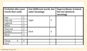
So if you’re researching perceptions of a product, you might list the terms people use to describe it, and record how often each descriptive term is mentioned. The result is a list looking something like the one below. In practice, the list is usually much longer, and the length can cause practical problems.

Entering data on a spreadsheet enables you to list the terms alphabetically, and to easily total the number of times each term is mentioned.
This enables you to populate the verbatim (i.e. precise words) column in the table that shows the various levels of content analysis.
In this first step, it’s important to be strict about only counting identical phrasings together. So “pale” and “pale-ish” are listed separately from each other.
This is important because in many fields there are technical terms that look similar, but have very different meanings (e.g. sulphide and sulphite in chemistry). Also, different participants sometimes mean different things by the same word, so even lumping verbatim terms together should be treated with caution.

You can group some of the terms together into broader categories, if they mean something very similar; e.g. “pale” and “lightish”. This allows you to populate the gist (i.e. same meaning) column. For the gist column, you add together the numbers of verbatim words aggregated within the category (so 5 mentions of “pale” plus 1 mention each of “pale-ish” and “lightish” plus 2 of “white” make a total of 9).
We now have 9 gist mentions of “light” and 6 gist mentions of “dark”.


The terms “light” and “dark” have opposite meanings, but they both relate to shade. We can now aggregate these two gist terms together in the superordinate category of ‘shade’ and sum their numbers, giving us a total of 15.
You can now go on to do the same for other descriptive terms that were mentioned, such as cost.
How do you decide which gist and superordinate categories to use?
There are various ways, including:
•what you think they should be
•what an independent judge thinks they should be
•what a thesaurus says they should be
•categories used in the previous literature.
That’s a swift overview of ‘vanilla flavour’ content analysis.

At the end of all this you have a batch of numbers, but what do they actually tell you?
Here’s a hypothetical example of content analysis being is used to compare findings from the published literature, with data from a study about perceptions of the key features of a website.
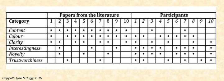
In Table 3, the first ten columns show findings from published research papers. The second ten columns are your ten research participants; each row represents one of the categories that you used in your content analysis. (Participant numbers are in italics, for clarity).
A black dot in a cell shows that the category in question is mentioned by the relevant paper or participant. This is the simplest form of notation, a binary mentioned/not mentioned division; you could show other things in the cells instead, such as how often each category is mentioned. This format lets you see at a glance how closely the literature corresponds with what you found.

For example, all the papers from the literature in this sample mentioned content, but only two of your participants mentioned content. That’s an interesting difference. Conversely, most of the participants mentioned interestingness, novelty, and trustworthiness, but only a few of the papers from the literature mentioned these categories. Overall, this table suggests that there’s a considerable mis-match between what the literature is mentioning and what the participants are mentioning.
We can see other patterns within this table. Among the human participants, every participant who mentioned interestingness also mentioned novelty. Does this mean that the participants are treating the two concepts as synonyms, or do they think that one of those concepts always involves the other? That would be a clear candidate for some follow-up research.
Another striking feature is participant 9, who only mentions trustworthiness; was this someone who just didn’t give many answers, or was this someone who had a very different way of thinking about this topic? Again, follow-up research would be needed to find the answer.
This is an especially powerful approach if your participants are from a demographic group that hasn’t featured much in the published literature. The vast majority of studies published in journal articles use western university students as participants, so if you gather data from participants who aren’t western university students, then you can do a neat, simple compare-and-contrast between your findings and the findings from previous studies.
That still leaves the question of what the differences and similarities mean, which you’d need to explore in a further study using perhaps observation to find out what’s actually happening, or laddering to find out about values and beliefs.
This way of doing content analysis is clear, tidy, simple and completely traceable; a reader can see exactly how you arrived at the numbers you did, at each step of the way.
Grounded theory is an approach that involves trying to have full traceability from each level of categorisation back to the original data. This has similarities to laddering, which we prefer because it gathers information directly, rather than indirectly via grounded theory analysis of texts.
Cognitive causal maps apply graph theory to show the networks of reasoning and evidence used within a text. The classic work by Axelrod and his colleagues contains some excellent examples such as politicians’ reasoning about international policy and how cognitive causal maps can be used to predict the future actions of individual decision-makers.
Search Visualiser lets you see thematic structures within a text, such as where and how often women (as opposed to men) are mentioned, or where hesitation words on an aircraft flight recorder are an indication of a problem arising. There are more examples on the Search Visualiser blog.
Discourse analysis involves looking at the dynamic aspects of two or more people verbally interacting (whether in a conversation, a group meeting, an email exchange, or in some other medium). This approach can give useful insights into e.g. power structures among the people involved – who interrupts whom, and who is able to change the subject being discussed.
Graphs, maps, trees is the title of a fascinating book by Moretti. It brings together a variety of ways of analysing texts, such as showing the spatial distribution of the places mentioned within a novel, or the number of books published within a particular genre over time.
Statistical approaches, including lexicostatistics are useful for fine-grained analysis, and for answering questions such as who might be the author of a particular anonymous work.
Story grammars are powerful formalisms for analysing the plot structures of stories, including books and film scripts. The classic early work was done by Vladimir Propp; his approach is still highly relevant today.
Done well, content analysis frequently produces unexpected findings, or findings in one knowledge domain that have significant implications for others.