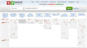
The image opposite shows the first ten results from a Search Visualiser Internet search for two keywords. Each of the columns is a web page that it has found. Each tiny square in each column represents a word; the top left square in each column is the first word in that web page, and the last square in the bottom row is the last word in that web page. Occurrences of the first keyword are shown in dark red; occurrences of the second keyword are shown in medium green.
The records vary in length. The first record is comparatively long; the third is very short, and is probably a placeholder page, with the keywords occurring in its metadata, and not in the web page itself.
The records also vary in how the keywords are distributed within a record. In the first record (the column on the left) the keywords occur in three bands, with both keywords occurring in all three bands. In the column on the right, the two keywords occur repeatedly throughout the column, though in the middle part of the column only the first keyword appears.
It’s possible to tell a lot about each document from this visualisation, such as how long each document is, how much relationship there is between the keywords in each document, how each document is structured, etc. This makes it easier to decide which documents are likely to be worth reading (clicking on a column on screen takes the user to the web page in question).
Another advantage of this representation is that it helps with searches of literature in other languages. The record opposite is for the German translations of bradycardia and medication.
Mentions of bradycardia and medication in an online search in German
